A new brand for a homeschool collective empowering families
with personalized learning and meaningful educational support.
Colorado Homeschool Enrichment exists to support families pursuing a more intentional path in education. As the organization grew, they needed a visual identity that could communicate clarity, guidance, and trust while still feeling approachable and modern.
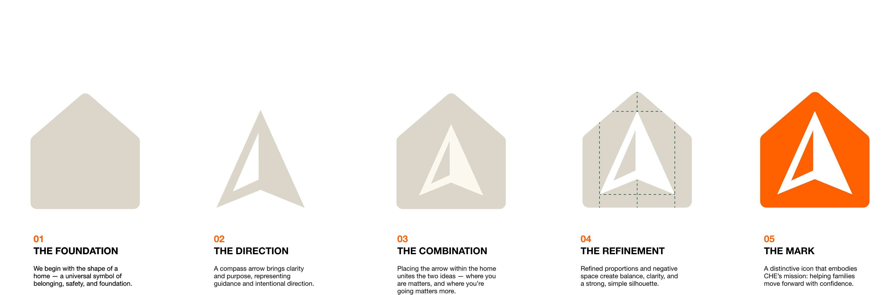
The challenge was creating a brand that felt grounded in home and family, while also reflecting movement, direction, and momentum.
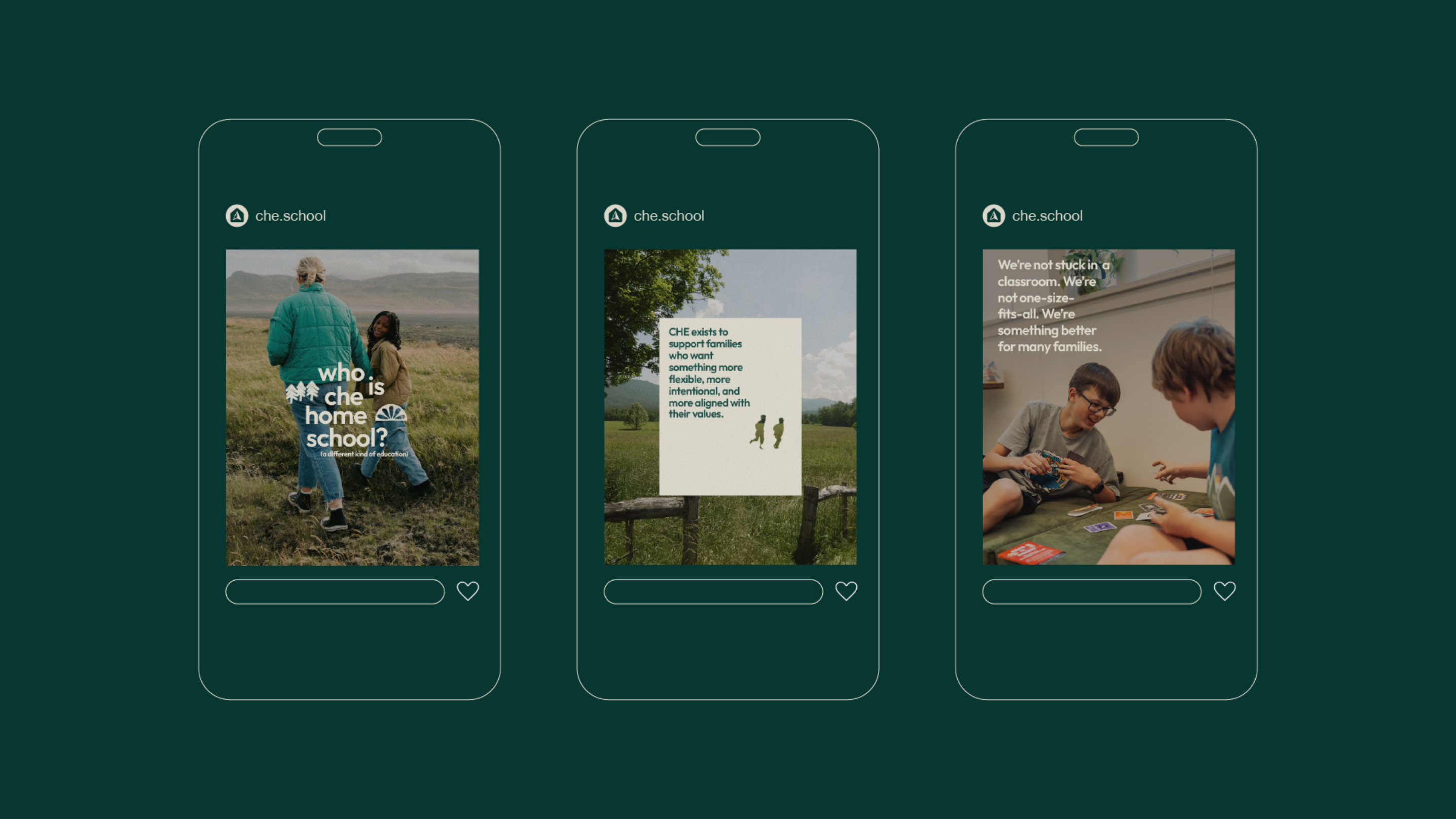
CHE wasn’t simply another educational program. It was a guide for families navigating an entirely different way of learning.
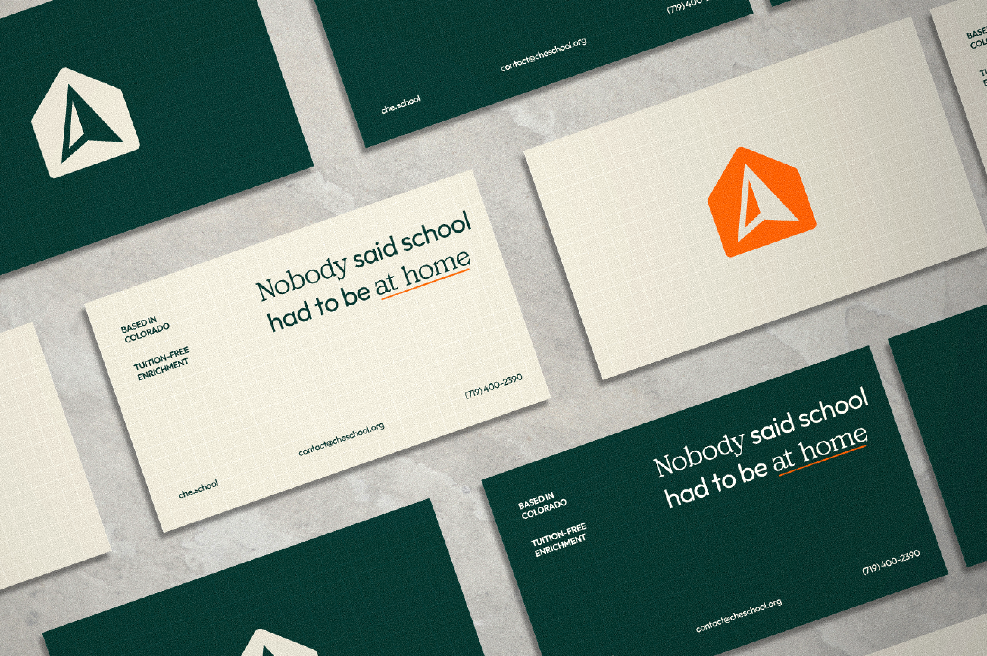


The icon can function independently in smaller applications while the full lockup communicates the organization most completely when space allows. Consistency was a major focus throughout the system: clear spacing rules, scalable logo variants, and adaptable layouts ensure the identity remains recognizable across every touchpoint.
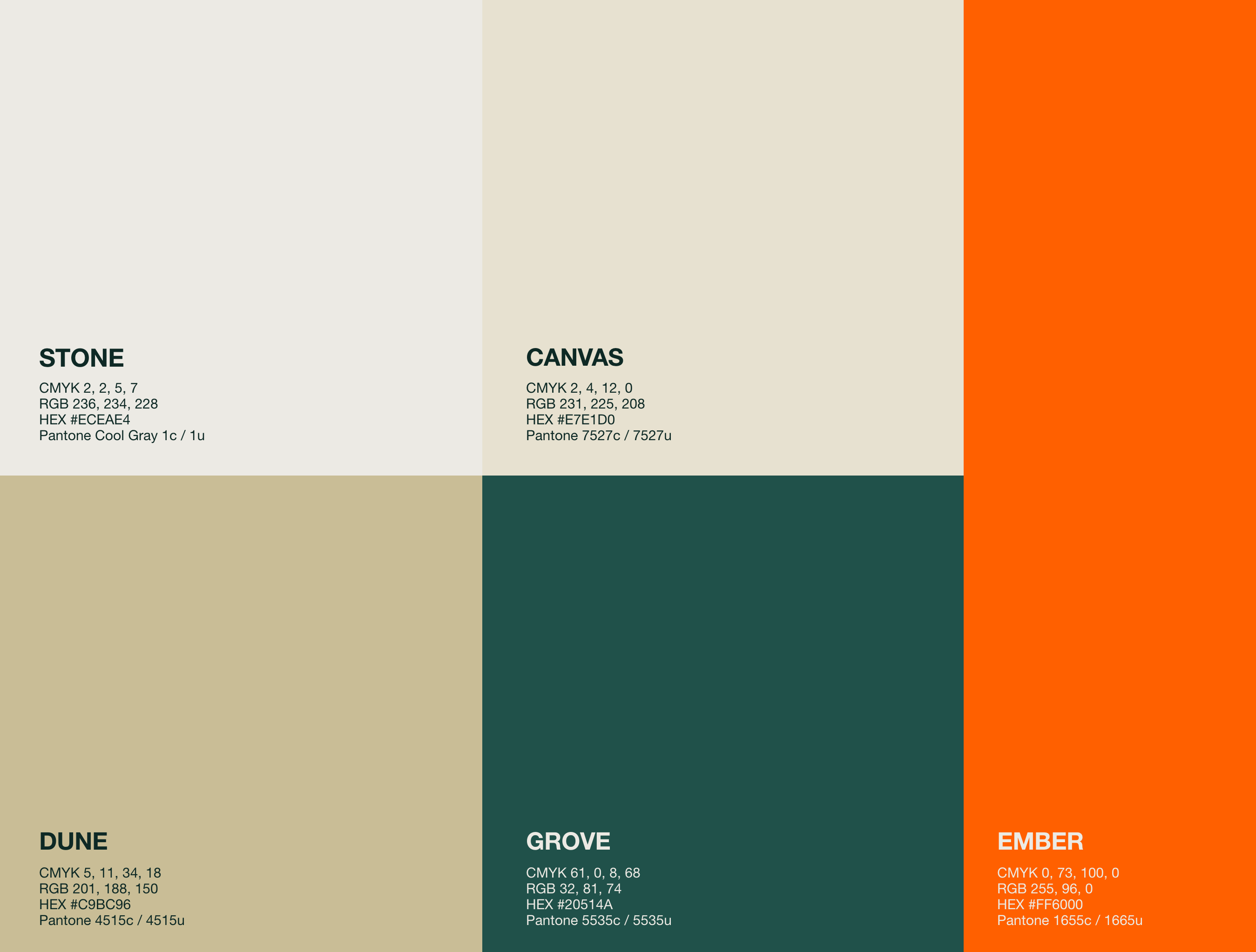
The palette balances warmth and professionalism.A bold orange serves as the primary accent — used intentionally to create moments of energy and emphasis, while deep greens and neutral tones provide stability and calm.The result feels educational without becoming sterile and modern without losing warmth.
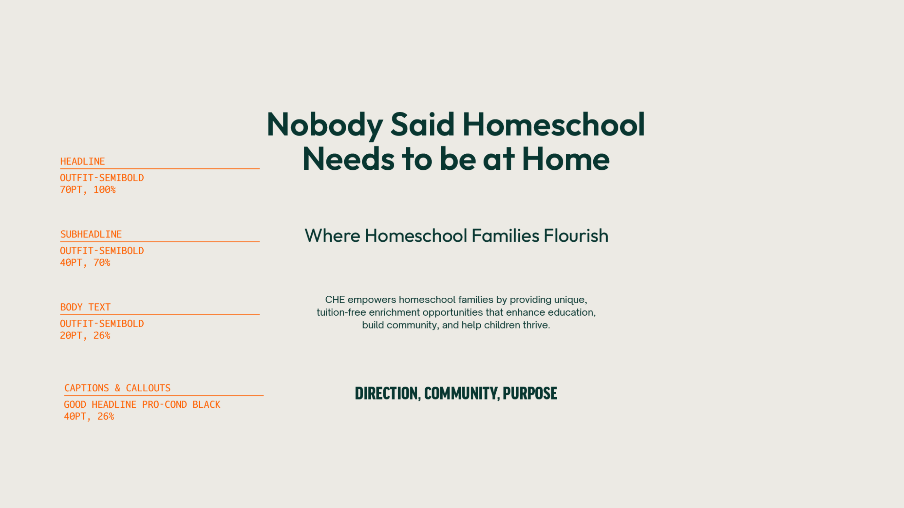
Typography played a major role in shaping the tone of the identity.Outfit was selected for headlines because of its modern geometry and strong readability, while Open Sauce brings clarity and accessibility to body copy.Together, the type system creates a voice that feels confident, approachable, and contemporary.